깃허브 블로그 커스텀
해당 블로그는 minimal-mistakes 테마를 커스텀하여 사용하고 있다.
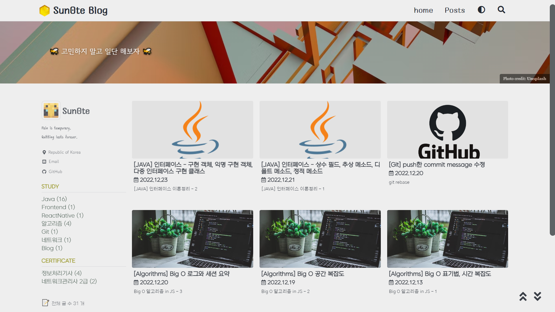
list 형식으로 바꾸기 전에는 Grid 형식으로 메인 화면구성했다.
나름 열심히 커스텀한 그리드 메인화면이 마음에 들어 이후로 꾸준히 썼다.
이전 메인화면 (grid)
상단과 sidebar 는 layouts\home.html 의 형식처럼 하면서 나머지 공간은 넓게 쓰고 싶어서
index.html 의 layout 을 archive 로 바꾸고 코드를 추가해서 사용했다.
index.html코드
1
2
3
4
5
6
7
8
9
10
11
12
13
14
15
16
17
18
---
excerpt : "🐝 고민하지 말고 일단 해보자 🐝 "
layout: archive
sidebar_main: ture
author_profile: true
entries_layout: grid
header:
    overlay_image: https://images.unsplash.com/photo-1663863067918-6bab4d94eb7a?ixlib=rb-1.2.1&ixid=MnwxMjA3fDB8MHxwaG90by1wYWdlfHx8fGVufDB8fHx8&auto=format&fit=crop&w=1332&q=80
    overlay_filter: 0.1 # same as adding an opacity of 0.5 to a black background
    caption: "Photo credit: [**Unsplash**](https://unsplash.com)"
---

<div class="grid__wrapper">
{% for post in paginator.posts %}
{% include archive-single.html type="grid" %}
{% endfor %}
</div>
{% include paginator.html %}
archive-single.html코드
1
2
3
4
5
6
7
8
9
10
11
12
13
14
15
16
17
18
19
20
21
22
23
24
25
26
27
28
29
30
{% if post.header.teaser %}
  {% capture teaser %}{{ post.header.teaser }}{% endcapture %}
{% else %}
  {% assign teaser = site.teaser %}
{% endif %}

{% if post.id %}
  {% assign title = post.title | markdownify | remove: "<p>" | remove: "</p>" %}
{% else %}
  {% assign title = post.title %}
{% endif %}

<div class="{{ include.type | default: 'list' }}__item">
  <article class="archive__item" itemscope itemtype="https://schema.org/CreativeWork">
    {% if include.type == "grid" and teaser %}
      <div class="archive__item-teaser">
        <img src="{{ teaser | relative_url }}" alt="">
      </div>
    {% endif %}
    <h2 class="archive__item-title no_toc" itemprop="headline">
      {% if post.link %}
        <a href="{{ post.link }}">{{ title }}</a> <a href="{{ post.url | relative_url }}" rel="permalink"><i class="fas fa-link" aria-hidden="true" title="permalink"></i><span class="sr-only">Permalink</span></a>
      {% else %}
        <a href="{{ post.url | relative_url }}" rel="permalink">{{ title }}</a>
      {% endif %}
    </h2>
    {% include page__meta.html type=include.type %}
    {% if post.excerpt %}<p class="archive__item-excerpt" itemprop="description">{{ post.excerpt | markdownify | strip_html | truncate: 160 }}</p>{% endif %}
  </article>
</div>
- 그리드는 한 줄에 4개에서 3개로 넓게 쓰고 싶어서
\sass\minimal-mistakes\_archive.scss에서 코드를 수정했다.
.grid__item 에 있는 @include breakpoint($medium) 부분이다.
1
2
3
4
5
6
7
8
9
10
11
12
13
14
15
16
17
18
19
20
21
22
23
24
25
26
27
28
29
30
31
32
33
34
35
36
37
38
39
40
41
42
43
44
45
46
47
48
49
50
51
52
53
54
55
56
57
58
59
60
61
62
63
64
65
66
67
68
69
70
71
72
73
74
75
76
77
78
79
80
81
82
83
84
85
86
87
88
89
90
91
92
93
94
95
96
97
98
99
100
101
102
103
104
105
106
107
108
109
110
.grid__item {
margin-bottom: 2em;
transition: all 0.2s linear;  //hover 시간 조정
backdrop-filter: blur(10px);
height: 100%;
padding: 3px;

&:hover {
    box-shadow: 1px 1px 3px 1px mix(rgb(122, 122, 122), $background-color, 10%);
    transform: translate(0, -15px);
    }

&:hover img {
    transform: translate(0, -15px); //scale(1.1);
}

@include breakpoint($small) {
    float: left;
    width: span(5 of 10);

    &:nth-child(2n + 1) {
    clear: both;
    margin-left: 0;
    }

    &:nth-child(2n + 2) {
    clear: none;
    margin-left: gutter(of 10);
    }
}

//grid 4배열에서 3배열
@include breakpoint($medium) {
    margin-left: 0; /* override margin*/
    margin-right: 0; /* override margin*/
    width: span(4 of 12); //width: span(3 of 12);

    min-height: 12em; //추가

    &:nth-child(2n + 1) {  //&:nth-child(2n + 1) {
    clear: none;
    }

    &:nth-child(3n + 1) { //&:nth-child(4n + 1) {
    clear: both;
    margin-left: 0;
    }

    &:nth-child(3n + 2) { //&:nth-child(4n + 2) {
    clear: none;
    margin-left: gutter(1 of 12);
    }

    &:nth-child(3n + 3) { //&:nth-child(4n + 3) {
    clear: none;
    margin-left: gutter(1 of 12);
    }

    /*
    &:nth-child(4n + 4) {
    clear: none;
    margin-left: gutter(1 of 12);
    }
    */
}

.page__meta {
    margin: 0 0 4px;
    font-size: 0.9em;
    font-style: $myfont_grid_title;
    font-weight: bold;
    margin-top: 5px;
}

.page__meta-sep {
    display: block;

    &::before {
    display: none;
    }
}

//참고 글 리스트
.archive__item-title {
    margin-top: 0.5em;
    font-size: $type-size-5; //$type-size-5;
}

.archive__item-excerpt {
    display: inline-block; //none;

    @include breakpoint($medium) {
    display: block;
    font-size: 0.8em;  //$type-size-6;
    }
}

.archive__item-teaser {
    @include breakpoint($small) {
    min-height: 130px;
    //max-height: 200px;
    background-size: contain;  //비율 강제 고정
    }

    @include breakpoint($medium) {
    //max-height: 120px;
    background-size: contain; //비율 강제 고정
    }
}
}
- \sass\minimal-mistakes\
_archive.scss에서 포스트의 썸네일 부분인 teaser도 커스텀 했다.
1
2
3
4
5
6
7
8
9
10
11
12
13
14
15
16
17
18
19
20
.archive__item-teaser {
position: relative;
border-radius: $border-radius;
overflow: hidden;

display: flex;
justify-content: center;

background-color: mix(rgb(122, 122, 122), $background-color, 10%);
backdrop-filter: blur(10px);
width: 100%;
max-height: 10em;
margin-bottom: 5px;

img {
    margin: auto;
    position: relative;  //absolute;
    object-fit: fill;
}
}
그런데…
아래의 글을 읽고 메인 화면을 심플하게 변경하기로 마음먹었다.
글에서 중요하게 언급하는 가독성에서 중요한 부분이 컬러였는데
위의 grid 형식의 메인화면을 보면 …
보다시피 알록달록하다. 🤦♂️
좀 더 심플하게 변경하여 가독성을 높이기 위해서 메인화면을 안 바꿀 수가 없었다.
변경 메인화면 (list)
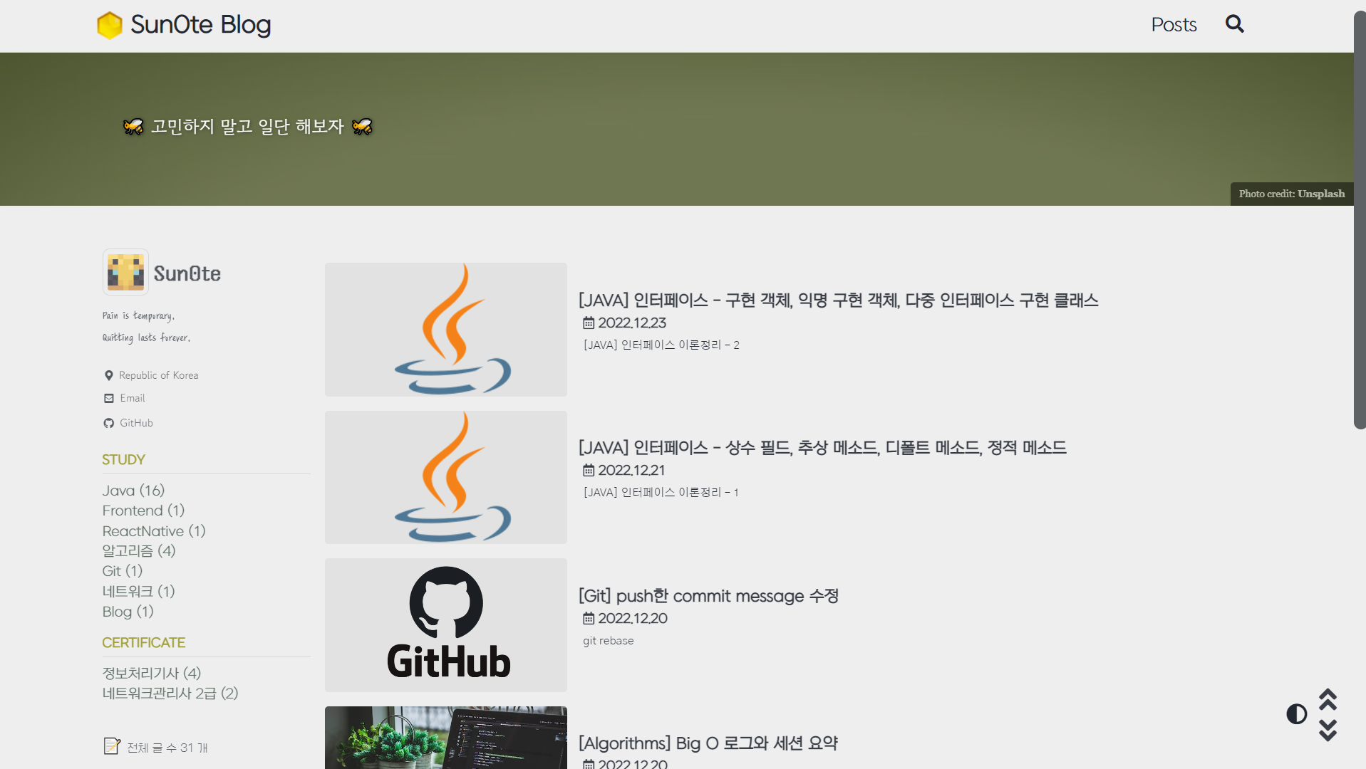
상단바도 메인 폰트로 통일하고 Header 의 이미지도 메인 컬러같이 심플하게 변경했다.
back to top, back to bottom 버튼을 위 아래로 정렬하고 다크모드 버튼의 위치도 옮겼다.
필자는 습관적으로 모바일에서 본인이 올린 블로그의 글을 계속 읽어보는데 다크모드로 변경하는데 있어서
버튼이 상단바에 있는 것보다 하단에 있는 것이 더 유용하다고 판단했다.
list 형식에서 thumbnail 도 추가하고 싶어서 index.html 코드를 수정하고
archive-single3.html 을 새로 생성하여 list 형식에도 썸네일을 보이게 구성했다.
index.html코드
1
2
3
4
5
6
7
8
9
10
11
12
13
14
15
16
17
18
---
excerpt : "🐝 고민하지 말고 일단 해보자 🐝 "
layout: archive
sidebar_main: ture
author_profile: true
entries_layout: list
header:
    overlay_image: <https://images.unsplash.com/photo-1617957848716-7585a98106ae?ixlib=rb-4.0.3&ixid=MnwxMjA3fDB8MHxwaG90by1wYWdlfHx8fGVufDB8fHx8&auto=format&fit=crop&w=1332&q=80>
    overlay_filter: 0.5 # same as adding an opacity of 0.5 to a black background
    caption: "Photo credit: [**Unsplash**](https://unsplash.com)"
---

<div class="grid__wrapper">
    {% for post in paginator.posts %}
    {% include archive-single3.html type="list" %}
    {% endfor %}
</div>
{% include paginator.html %}
archive-single3.html코드
1
2
3
4
5
6
7
8
9
10
11
12
13
14
15
16
17
18
19
20
21
22
23
24
25
26
27
28
29
30
31
32
33
34
35
36
37
38
39
{% if post.header.teaser %}
  {% capture teaser %}{{ post.header.teaser }}{% endcapture %}
{% else %}
  {% assign teaser = site.teaser %}
{% endif %}

{% if post.id %}
  {% assign title = post.title | markdownify | remove: "<p>" | remove: "</p>" %}
{% else %}
  {% assign title = post.title %}
{% endif %}

<div class="{{ include.type | default: 'list' }}__item">
  <article class="archive__item" itemscope itemtype="https://schema.org/CreativeWork">
    {% if include.type == "grid" and teaser %}
    <div class="archive__item-teaser">
      <img src="{{ teaser | relative_url }}" alt="">
    </div>
    {% endif %}

    {% if include.type == "list" and teaser %}
    <div class="archive__item-teaser_list">
      <img src="{{ teaser | relative_url }}" alt="">
    </div>
    {% endif %}

    <div class="archive__item-postbox">
      <h2 class="archive__item-title no_toc" itemprop="headline">
        {% if post.link %}
        <a href="{{ post.link }}">{{ title }}</a> <a href="{{ post.url | relative_url }}" rel="permalink"><i class="fas fa-link" aria-hidden="true" title="permalink"></i><span class="sr-only">Permalink</span></a>
        {% else %}
        <a href="{{ post.url | relative_url }}" rel="permalink">{{ title }}</a>
        {% endif %}
      </h2>
    {% include page__meta.html type=include.type %}
    {% if post.excerpt %}<p class="archive__item-excerpt" itemprop="description">{{ post.excerpt | markdownify | strip_html | truncate: 160 }}</p>{% endif %}
    </div>
  </article>
</div>
썸네일 클래스 <div class="archive__item-teaser_list">과
블로그 글 클래스 <div class="archive__item-postbox"> 로 나누어서
나란히 나열되도록 위치와 크기를 커스텀하기 위해 _archive.scss에서 코드를 추가했다.
\sass\minimal-mistakes\_archive.scss코드
1
2
3
4
5
6
7
8
9
10
11
12
13
14
15
16
17
18
19
20
21
22
23
24
25
26
27
28
29
30
31
32
33
34
35
36
37
38
39
40
41
42
43
44
45
46
47
48
49
50
51
52
53
54
55
56
57
58
59
60
61
62
63
64
65
66
67
68
69
70
71
72
73
74
75
76
77
78
79
80
81
82
  .list__item {
    position: relative;
    display: inline-block;
    justify-content: center;
    width: 100%;
    height: auto;

    @media screen and (min-width: 600px) {
    .archive__item-teaser_list {
      position: relative;
      border-radius: $border-radius;
      overflow: hidden;
      margin-right: 0.5em;
      display: inline;
      justify-content: center;
      float : left;
      margin-bottom: 5px;

      background-color: mix(rgb(122, 122, 122), $background-color, 10%);
      backdrop-filter: blur(10px);
      width: 15em;
      max-height: 130px;
      text-align: center;
      vertical-align: middle;

      img {
        margin: auto;
        position: relative; //absolute;
        object-fit: contain;
        overflow: hidden;
        justify-content: center;
        transition: all 0.3s linear; //hover 시간 조정
      }

      @include breakpoint($small) {
        min-height: 130px;
        background-size: contain; //비율 강제 고정
      }

      @include breakpoint($medium) {
        background-size: contain; //비율 강제 고정
      }
    }
    }
    .archive__item-postbox {
      display: inline;
      padding-bottom: 0.25em;
      //float : left;
      clear: both;
      width: auto;
      vertical-align: middle;

      h2 {
          margin: 0 0 4px;
          padding-top: 5px;
        }
    }
}
.archive__item-caption {
  position: relative;  //absolute;
  bottom: 0;
  right: 0;
  margin: 0 auto;
  padding: 2px 5px;
  color: #fff;
  font-family: $caption-font-family;
  font-size: $type-size-8;
  background: #000;
  text-align: right;
  z-index: 5;
  opacity: 0.5;
  border-radius: $border-radius 0 0 0;

  @include breakpoint($large) {
    padding: 5px 10px;
  }

  a {
    color: #fff;
    text-decoration: none;
  }
}
다크모드 버튼도 이동하기 위해 _includes/masthead.html 에 있던 dark__toggle 코드를 삭제하고
_layouts/default.html <body> 부분에 있는 back to top, back to bottom 버튼 코드 아래 코드를 옮겼다.
이전 메인화면의 상단바에 있는 다크모드 버튼은 sohamsaha99님의 답변을 참고해서 똑같이 만들었습니다.
아래 글의 해당 설정을 했다는 전제하에 코드를 수정해야 합니다.
다크모드 버튼 추가하기
_layouts/default.html코드
1
2
3
4
5
6
7
8
9
10
11
12
13
14
15
16
17
18
19
20
21
22
23
24
25
    <!--사이드바 위, 아래, 홈버튼 기능 추가-->
    <aside class="sidebar__top">
      <a href="#site-nav"> <i class="fas fa-angle-double-up fa-2x"></i> </a>
    </aside>

    <aside class="sidebar__bottom">
      <a href="#footer"> <i class="fa fa-angle-double-down fa-2x"></i> </a>
    </aside>

    <!-- 라이트모드 토글 추가 -->
    <aside class= "dark__toggle">
      {% if site.minimal_mistakes_skin2 %}
        <i class="fas fa-adjust" aria-hidden="true" onclick="node1=document.getElementById('theme_source'); node2=document.getElementById('theme_source_2');
          if(node1.getAttribute('rel')=='stylesheet') {
            node1.setAttribute('rel', 'stylesheet alternate');
            node2.setAttribute('rel', 'stylesheet');
            sessionStorage.setItem('theme', 'dark');
          } else {
              node2.setAttribute('rel', 'stylesheet alternate');
              node1.setAttribute('rel', 'stylesheet');
              sessionStorage.setItem('theme', 'light');
          } return false;" style="cursor:pointer">
        </i>
      {% endif %}
    </aside>
_sass/minimal-mistakes/_sidebar.scss코드
1
2
3
4
5
6
7
8
9
10
11
12
13
14
15
16
17
18
19
20
21
22
23
.sidebar__top {
  position: fixed;
  bottom: 3.7em;
  right: 1.2em;
  z-index: 10;
}

.sidebar__bottom {
  position: fixed;
  bottom: 1.5em;
  right: 1.2em;
  z-index: 10;
}

.dark__toggle {
  position: fixed;
  bottom: 1.9em;
  right: 1.5em;
  z-index: 10;
  font-size: 1.5em;
  display: inline-block;
  color: $primary-color; //inline-block으로 설정 시 컬러 변경도 가능하다
}
변경된 코드는 여기서 자세히 확인할 수 있다.
카테고리, 태그 버튼 추가
이후 카테고리와 태크버튼도 나열되게 추가했다.
참고로 카테고리 태그버튼은 공부하는 식빵맘님의 블로그 글을 보고 응용한 것입니다.
좌측의 카테고리도 해당 블로그 글을 보고 추가한 것이니 참고해주세요.
식빵맘님의 카테고리 글 보러가기

_includes/archive-single.html코드
1
2
3
4
5
6
7
8
9
10
11
12
13
14
15
16
17
18
19
20
21
22
23
24
25
26
27
28
29
30
31
32
33
{% if post.header.teaser %}
  {% capture teaser %}{{ post.header.teaser }}{% endcapture %}
{% else %}
  {% assign teaser = site.teaser %}
{% endif %}

{% if post.id %}
  {% assign title = post.title | markdownify | remove: "<p>" | remove: "</p>" %}
{% else %}
  {% assign title = post.title %}
{% endif %}

<div class="{{ include.type | default: 'list' }}__item">
  <article class="archive__item" itemscope itemtype="https://schema.org/CreativeWork">
    {% if include.type == "grid" and teaser %}
      <div class="archive__item-teaser">
        <img src="{{ teaser | relative_url }}" alt="">
      </div>
    {% endif %}
    <h2 class="archive__item-title no_toc" itemprop="headline">
      {% if post.link %}
        <a href="{{ post.link }}">{{ title }}</a> <a href="{{ post.url | relative_url }}" rel="permalink"><i class="fas fa-link" aria-hidden="true" title="permalink"></i><span class="sr-only">Permalink</span></a>
      {% else %}
        <a href="{{ post.url | relative_url }}" rel="permalink">{{ title }}</a>
      {% endif %}
      {% include page__meta.html type=include.type %}
    </h2>
    {% if post.excerpt %}<p class="archive__item-excerpt" itemprop="description">{{ post.excerpt | markdownify | strip_html | truncate: 160 }}</p>{% endif %}
    {% if site.category_archive.type and post.categories[0] and site.tag_archive.type and post.tags[0] %}
    {%- include post__taxonomy.html -%}
    {% endif %}
  </article>
</div>
archive-single3.html코드
1
2
3
4
5
6
7
8
9
10
11
12
13
14
15
16
17
18
19
20
21
22
23
24
25
26
27
28
29
30
31
32
33
34
35
36
37
38
39
40
41
42
{% if post.header.teaser %}
  {% capture teaser %}{{ post.header.teaser }}{% endcapture %}
{% else %}
  {% assign teaser = site.teaser %}
{% endif %}

{% if post.id %}
  {% assign title = post.title | markdownify | remove: "<p>" | remove: "</p>" %}
{% else %}
  {% assign title = post.title %}
{% endif %}

<div class="{{ include.type | default: 'list' }}__item">
  <article class="archive__item" itemscope itemtype="https://schema.org/CreativeWork">
    {% if include.type == "grid" and teaser %}
    <div class="archive__item-teaser">
      <img src="{{ teaser | relative_url }}" alt="">
    </div>
    {% endif %}

    {% if include.type == "list" and teaser %}
    <div class="archive__item-teaser_list">
      <img src="{{ teaser | relative_url }}" alt="">
    </div>
    {% endif %}

    <div class="archive__item-postbox">
      <h2 class="archive__item-title no_toc" itemprop="headline">
        {% if post.link %}
        <a href="{{ post.link }}">{{ title }}</a> <a href="{{ post.url | relative_url }}" rel="permalink"><i class="fas fa-link" aria-hidden="true" title="permalink"></i><span class="sr-only">Permalink</span></a>
        {% else %}
        <a href="{{ post.url | relative_url }}" rel="permalink">{{ title }}</a>
        {% endif %}
      </h2>
    {% include page__meta.html type=include.type %}
    {% if post.excerpt %}<p class="archive__item-excerpt" itemprop="description">{{ post.excerpt | markdownify | strip_html | truncate: 160 }}</p>{% endif %}
    {% if site.category_archive.type and post.categories[0] and site.tag_archive.type and post.tags[0] %}
    {%- include post__taxonomy.html -%}
    {% endif %}
    </div>
  </article>
</div>
카테고리와 테그 버튼의 스타일은 아래의 코드를 참고하면 된다.
_archive_scss코드
1
2
3
4
5
6
7
8
9
10
11
12
13
14
15
16
17
18
19
20
21
22
23
24
25
26
27
28
29
30
31
32
33
34
35
.page__taxonomy-item-category {
  display: inside;
  margin-right: 5px;
  margin-bottom: 8px;
  padding: 5px 10px;
  color: $text-color;
  font-family: $myfont_a1;
  text-decoration: none;
  border: 1px solid $link-color-visited;
  border-radius: $border-radius;

  &:hover {
    text-decoration: none;
    background-color: $link-color-visited; /* 커서 댈 때 색깔 */
    color: #eaeaea;
  }
}

  .page__taxonomy-item-tag {
    display: inside;
    margin-right: 5px;
    margin-bottom: 8px;
    padding: 5px 10px;
    color: $text-color;
    font-family: $myfont_a1;
    text-decoration: none;
    border: 1px solid mix($text-color, $background-color, 30%);
    border-radius: $border-radius;

  &:hover {
    text-decoration: none;
    background-color: rgb(156, 156, 156); /* 커서 댈 때 색깔 */
    color: #eaeaea;
  }
}
변경된 코드는 여기서 자세히 확인할 수 있다.
참고 URL
썸네일 참고
메인화면 참고
css div 정렬 참고
다크모드 버튼 참고
그리드 배열 참고
카테고리, 태그버튼 참고
🌞 정보 : 공부 기록용 블로그입니다. 오타나 내용 오류가 있을 경우 알려주시면 감사하겠습니다.

댓글남기기